(
Mar 12, 2024
)
One print and design branding
Ink Your Ideas!
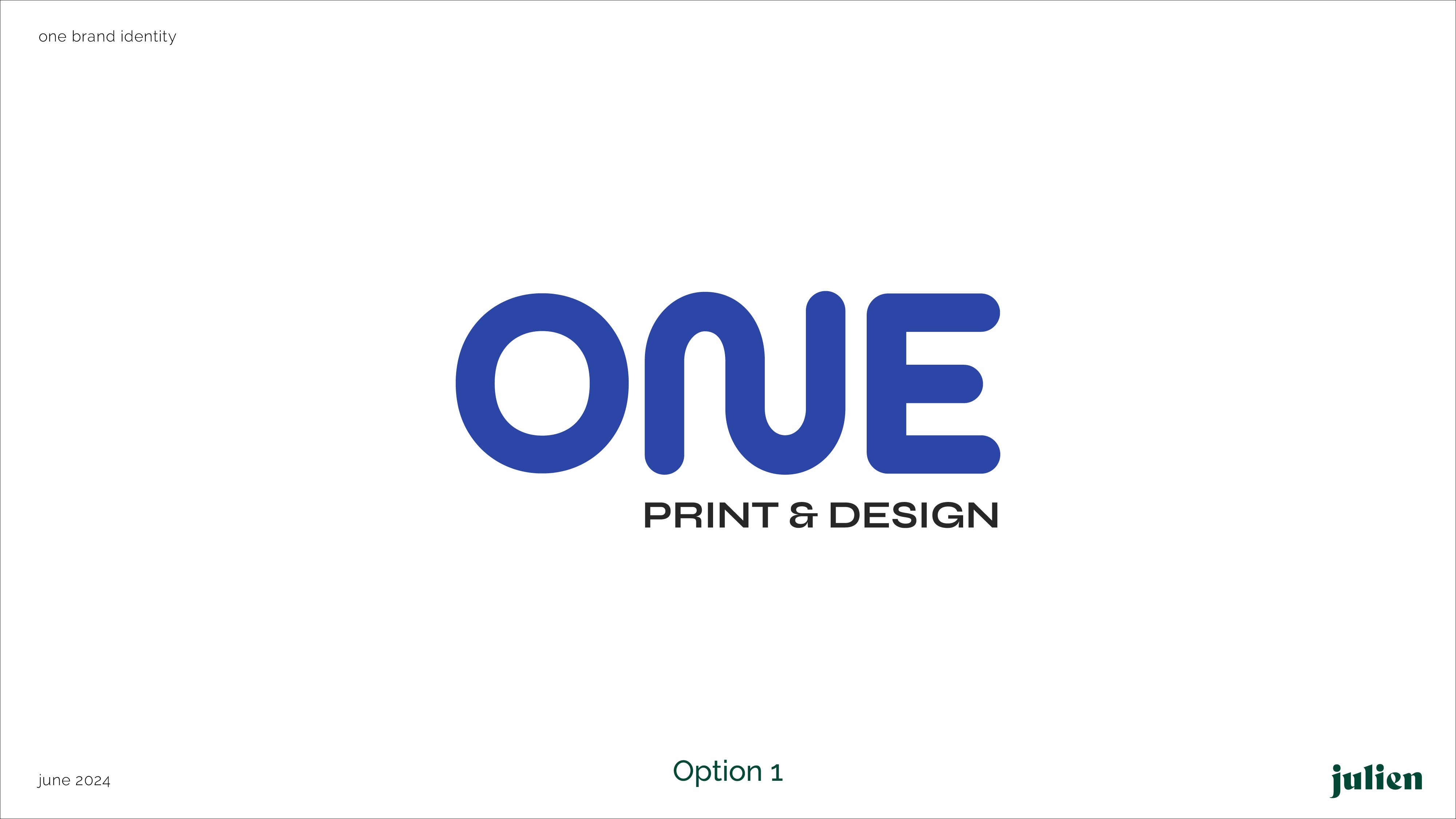
The logo features simple yet modern shapes that symbolize the fluid nature of our business. The loop represents the intersection of effective communication and execution. Its rounded edges convey a smooth and hassle-free process. The use of blue color makes the brand trustworthy, dependable and safe
Research & Inspiration
We began by understanding the brand's values, goals, and target audience. Research included exploring design trends, competitor analysis, and gathering inspiration to align the logo with the brand identity.
Concept Development
Initial sketches focused on creating simple yet meaningful shapes. The loop emerged as a core element, symbolizing fluidity, communication, and execution, while rounded edges ensured the design felt approachable and smooth.Color Selection
Blue was chosen for its psychological associations with trust, reliability, and safety. Variations in shades were tested to ensure visual balance and brand alignment.Refinement
Multiple iterations of the design were created, focusing on proportions, symmetry, and versatility. Feedback was incorporated to refine the shapes, ensuring they conveyed modernity and professionalism.Finalization
The final logo was tested across different applications (digital, print, etc.) to ensure clarity, scalability, and impact. The result is a modern, fluid design that represents the brand's essence and values.


View More


(
Mar 12, 2024
)
One print and design branding
Ink Your Ideas!
The logo features simple yet modern shapes that symbolize the fluid nature of our business. The loop represents the intersection of effective communication and execution. Its rounded edges convey a smooth and hassle-free process. The use of blue color makes the brand trustworthy, dependable and safe
Research & Inspiration
We began by understanding the brand's values, goals, and target audience. Research included exploring design trends, competitor analysis, and gathering inspiration to align the logo with the brand identity.
Concept Development
Initial sketches focused on creating simple yet meaningful shapes. The loop emerged as a core element, symbolizing fluidity, communication, and execution, while rounded edges ensured the design felt approachable and smooth.Color Selection
Blue was chosen for its psychological associations with trust, reliability, and safety. Variations in shades were tested to ensure visual balance and brand alignment.Refinement
Multiple iterations of the design were created, focusing on proportions, symmetry, and versatility. Feedback was incorporated to refine the shapes, ensuring they conveyed modernity and professionalism.Finalization
The final logo was tested across different applications (digital, print, etc.) to ensure clarity, scalability, and impact. The result is a modern, fluid design that represents the brand's essence and values.
View More
(
Mar 12, 2024
)
One print and design branding
Ink Your Ideas!
The logo features simple yet modern shapes that symbolize the fluid nature of our business. The loop represents the intersection of effective communication and execution. Its rounded edges convey a smooth and hassle-free process. The use of blue color makes the brand trustworthy, dependable and safe
Research & Inspiration
We began by understanding the brand's values, goals, and target audience. Research included exploring design trends, competitor analysis, and gathering inspiration to align the logo with the brand identity.
Concept Development
Initial sketches focused on creating simple yet meaningful shapes. The loop emerged as a core element, symbolizing fluidity, communication, and execution, while rounded edges ensured the design felt approachable and smooth.Color Selection
Blue was chosen for its psychological associations with trust, reliability, and safety. Variations in shades were tested to ensure visual balance and brand alignment.Refinement
Multiple iterations of the design were created, focusing on proportions, symmetry, and versatility. Feedback was incorporated to refine the shapes, ensuring they conveyed modernity and professionalism.Finalization
The final logo was tested across different applications (digital, print, etc.) to ensure clarity, scalability, and impact. The result is a modern, fluid design that represents the brand's essence and values.
